SaaS Gamification Design
September 8, 2025
SaaS Gamification Design: The Psychology of Engagement That Actually Converts

80% of B2B buyers are mobile. Is your SaaS ready? Learn the MOBILE framework that captures 64% higher conversions through mobile-first design.
Your highest-paying enterprise client just called. They're furious.
Not because your SaaS doesn't work. Not because you missed a deadline. But because the CEO tried to pull up your dashboard during a board meeting on their iPad, and what they saw made them look incompetent in front of investors.
"It looked like a website from 2003," they said. "How are we supposed to take you seriously?"
Here's the kicker: Your platform looks stunning on desktop. Award-winning, even. But on mobile? It's a dumpster fire wearing a tuxedo.
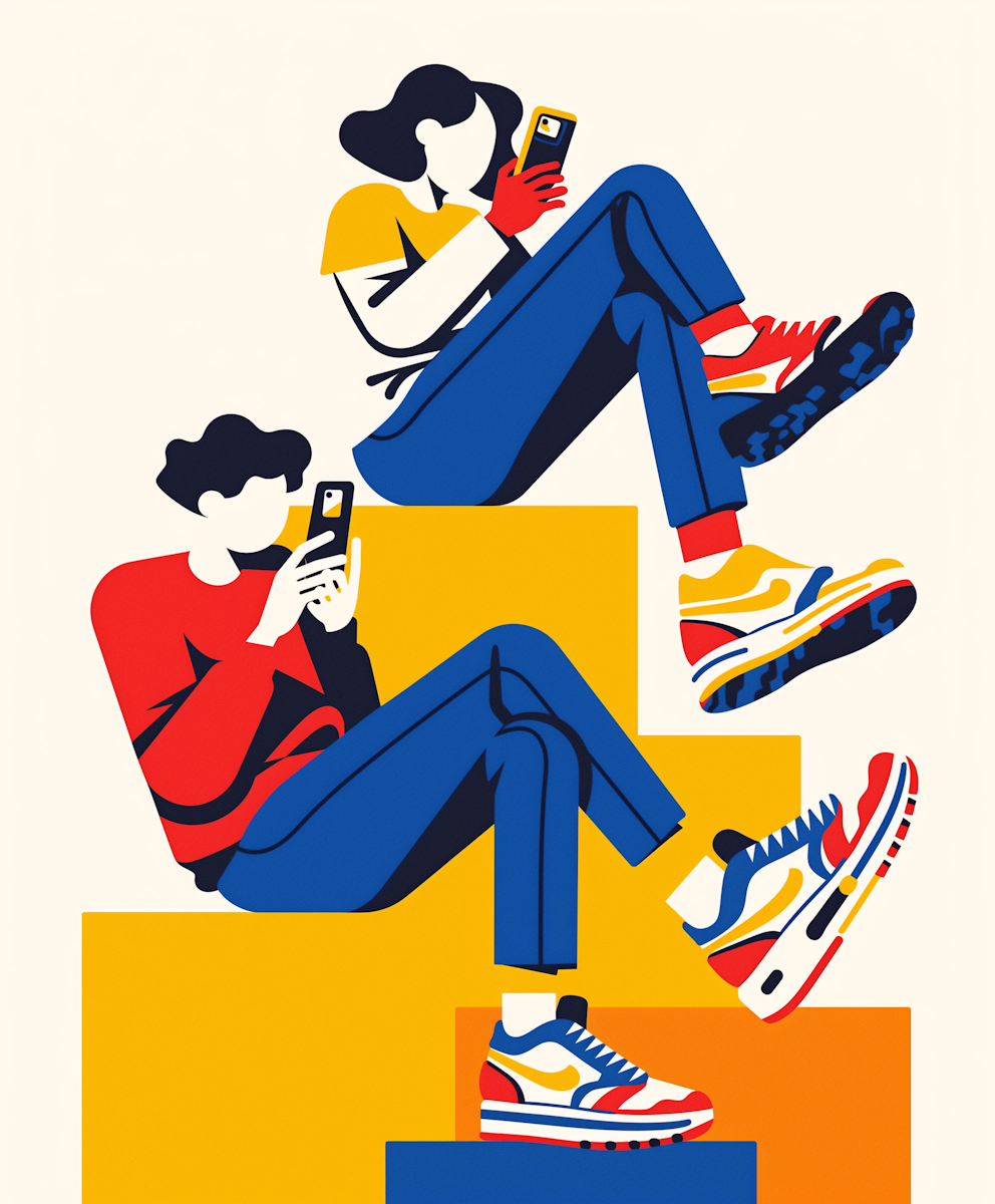
And before you say "our users don't use mobile"—let me stop you right there. 80% of B2B buyers use mobile devices at various stages of their purchasing journey. Yet most SaaS companies still design desktop-first, treating mobile like that cousin you reluctantly invite to Thanksgiving.
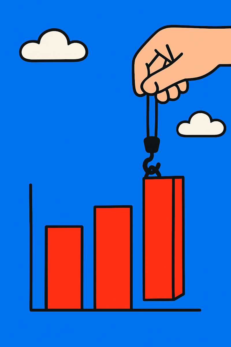
The cost? While desktop conversions stagnate, mobile conversion rates have increased by 64% compared to desktop. Companies with poor mobile first SaaS design are literally watching money walk out the door.
But here's what's really happening: Your desktop-first approach isn't just hurting mobile users. It's revealing that you fundamentally misunderstand how modern work actually works.
Let's shatter some comfortable delusions about your users:
Remember "the office"? That quaint place where people sat at desks from 9 to 5? Yeah, that's as outdated as your mobile experience.
Your users are:
The modern workplace isn't a place—it's wherever your users happen to be. And wherever they are, they're probably on a mobile device. In fact, 90% of mobile internet time is spent using apps—not sitting at desktops pretending to work.
Plot twist: The C-suite executives who sign your contracts are increasingly mobile-first users. They're not hunched over desktop computers. They're reviewing your platform between meetings, during commutes, and from their vacation homes.
When your SaaS mobile design fails, you're not just frustrating some junior employee. You're annoying the person who decides whether to renew your $100K annual contract.
Here's what most designers get wrong: Mobile users aren't just desktop users on smaller screens. They're in completely different contexts with different goals.
Research suggests that mobile users complete tasks faster when interfaces are designed mobile-first rather than adapted from desktop. This isn't about screen size—it's about fundamental differences in how humans interact with devices.
With mobile conversions up 64% while desktop stagnates, the message is clear: Mobile isn't the future—it's the profitable present.
Let me paint you a picture of what happens when desktop design meets mobile reality:
Your desktop dashboard proudly displays 47 metrics simultaneously. "Look at all this data!" you say. "So comprehensive!"
On mobile, those 47 metrics become 47 reasons to close your app and never return. It's like trying to read a newspaper through a keyhole while riding a unicycle.
The Reality: Mobile screens require ruthless prioritization. Every pixel must earn its place. That "comprehensive" desktop view? On mobile, it's just comprehensive confusion.
Your desktop interface has elegant hover states, tiny action icons, and precise click targets. Works great with a mouse!
On mobile, your users are playing a frustrating game of "tap the impossibly small button while the train is moving." Spoiler alert: They're losing. And when they accidentally tap the wrong thing for the fifth time, they're also losing their minds.
The Touch Target Truth: Real humans have fingers, not styluses. Those fingers are trying to tap your buttons while walking, holding coffee, or hanging onto a subway pole.
Your desktop version loads in 2 seconds on office WiFi? Fantastic!
Your mobile version loads in 12 seconds on spotty 4G? That's 11 seconds longer than your user's patience. Google's research confirms that mobile users abandon sites that take more than 3 seconds to load. Every additional second dramatically increases bounce rates.
Remember: 90% of mobile time is spent in apps that load instantly. Your slow-loading web app is competing with that expectation.
After watching countless SaaS companies struggle with their mobile experience, we developed the MOBILE framework. It's not revolutionary—it's just systematically strategic.
Stop trying to show everything. Start showing what matters.
The One-Thing Rule: Each mobile screen should do one thing brilliantly. Not five things adequately. One. Thing. Brilliantly.
Real example: A project management SaaS tried cramming their entire desktop dashboard onto mobile. Usage plummeted. We rebuilt it to show only "Today's Priority Tasks" on the home screen. Usage improved dramatically. Sometimes less isn't just more—it's the only thing that works.
Ruthless Prioritization in Action:
Design for thumbs, not cursors.
The Thumb Zone Reality: Most users hold phones one-handed. Their thumb can comfortably reach about 1/3 of the screen. Guess where your critical actions should be?
Touch Target Minimums That Actually Work:
The Gesture Revolution: Swipe to archive. Pinch to zoom. Pull to refresh. Your users expect these patterns. Fighting them is like putting doorknobs on the wrong side—technically functional, deeply frustrating.
Stop organizing by features. Start organizing by jobs to be done.
Bad Mobile Navigation: Reports > Analytics > Customer Analytics > Churn Analysis > Q3 2024
Good Mobile Navigation: "See Who's At Risk" (one tap)
Your users don't think in terms of your feature taxonomy. They think in terms of problems they need to solve. On mobile, every extra tap is a chance for them to give up.
The Search Solution: Mobile users often prefer searching to navigating. Make search prominent, fast, and smart. If they can Google it faster than finding it in your app, you've failed.
You can't show everything at once on mobile. So show things at the right time.
The Accordion Approach:
Example: Customer list on mobile:
Smart Defaults Based on Behavior: If users always check the same three metrics, make those the default view. Use data to drive design, not assumptions.
Mobile devices aren't desktop computers. Stop treating them like they are.
The Performance Reality Check:
Performance Tactics That Work:
Real talk: Users will forgive an ugly app that loads fast. They'll abandon a beautiful app that loads slow. Especially when 90% of their mobile time is spent in apps that respond instantly.
Mobile devices can do things desktops can't. Use them.
Push Notifications (When Done Right):
Camera Integration: Let users capture receipts, scan documents, or photograph inventory directly. It's faster than any desktop workflow.
Location Awareness: For field teams, location-based features are game-changers. Show nearby customers, optimize routes, or auto-populate location data.
A field service management SaaS was losing customers because their mobile app was essentially their desktop interface crammed into a phone screen. Technicians in the field couldn't work efficiently.
The Problem:
The Transformation:
The Impact: Customer satisfaction improved noticeably, technicians became more productive, and mobile app usage increased significantly. The mobile-first approach captured the 64% higher conversion rates the industry was seeing.
A CRM discovered their highest-value users—sales VPs and directors—were trying to use mobile during commutes and between meetings. The experience was pushing them toward competitors.
The Challenge: Desktop-first design assumed users had time to dig through detailed reports. Mobile executives needed insights, not data dumps.
The Solution:
The Results: Executive engagement improved substantially, mobile sessions became more productive, and enterprise accounts showed better retention. They captured their share of the B2B mobile revolution.
Enough theory. Here's your action plan:
Here's what nobody wants to admit: If your SaaS doesn't work brilliantly on mobile, you're already obsolete. You just don't know it yet.
While you're clinging to desktop-first design, 80% of B2B buyers are making purchasing decisions on mobile. While you're ignoring mobile optimization, competitors are capturing that 64% higher mobile conversion rate. While you're pretending mobile doesn't matter, 90% of mobile internet time is being spent in apps that make your web app look prehistoric.
Your competitors are redesigning for mobile-first right now. Your customers are evaluating alternatives that work on their phones. Your investors are wondering why your growth is stalling.
The choice isn't between desktop and mobile. It's between embracing how people actually work or becoming a cautionary tale about companies that couldn't adapt.
Mobile first SaaS design isn't a nice-to-have feature or a future consideration. It's a survival requirement. Today.
Building on principles from our SaaS dashboard design guide, mobile optimization requires rethinking every assumption about how users interact with your platform. The SaaS design best practices that work on desktop often fail spectacularly on mobile—especially when 80% of your buyers are mobile-first.
Ready to transform your mobile experience from embarrassment to competitive advantage? Our product design services include comprehensive mobile-first optimization that turns frustrated users into loyal advocates.
Because in 2025, there's no such thing as "desktop users" and "mobile users." There are just users—and they expect your SaaS to work brilliantly wherever they are.
Stop reading this on your desktop. Pull out your phone and try your own product. That pain you're feeling? That's your future walking out the door.