SaaS Gamification Design
September 8, 2025

Learn how to design SaaS dashboards that convert data into action using psychology-based principles. Includes ACTION framework and real-world case studies.

You know that moment when you're staring at your dashboard at 11 PM, trying to figure out why revenue dipped last week, clicking through seventeen different views, and still having no clue what actually happened?
Yeah, we need to talk about that.
Here's the uncomfortable truth: The average SaaS executive spends 23% of their day looking at dashboards, yet 67% report making decisions based on incomplete or confusing data. That's like spending two hours a day reading a map in a foreign language while driving blindfolded.
This disconnect between data availability and actionable insights isn't just frustrating—it's expensive. Every confused decision, every missed pattern, every "let me export this to Excel and figure it out myself" moment is costing you customers and revenue.
Let's be controversial for a moment: Most dashboard designers are solving the wrong problem.
They obsess over beautiful visualizations, perfect color gradients, and whether to use pie charts or donut charts (spoiler: neither). Meanwhile, your users are drowning in a sea of metrics, desperately trying to answer one simple question: "What should I do next?"
The real challenge isn't making data pretty—it's understanding the psychology of decision-making and designing interfaces that convert raw data into confident user action. Because at 11 PM, when that revenue dip is keeping you awake, you don't need a prettier graph. You need answers.
Here's where it gets interesting. The human brain processes visual information 60,000 times faster than text, yet most SaaS dashboards fail spectacularly at leveraging this superpower.
Why? Because they ignore how our brains actually work.
From an evolutionary perspective, humans are wired to crave control over our environment. It's literally a survival mechanism. When we can't predict or understand what's happening around us, our brains flip into panic mode—hello, fight or flight response at 11 PM!
This deep-seated psychological need manifests in modern dashboard UX design through three key strategies:
1. The Certainty PrincipleYour brain desperately wants to know: "Am I okay, or am I screwed?" Yet most dashboards make you work for this basic answer. Effective design puts critical status front and center—no hunting required.
2. The Crystal Ball EffectWe're prediction machines. We need to see not just where we are, but where we're heading. Trend visualization isn't a nice-to-have; it's a psychological necessity that transforms anxiety into action.
3. The Next Step NavigatorHere's the kicker: showing problems without clear solutions actually increases stress and decreases performance. Your dashboard needs to be a GPS, not just a speedometer.
Pop quiz: How many chunks of information can your short-term memory hold?
If you said "about 7," you're right. If you said "but my dashboard shows 47 metrics on the home screen," we've found your problem.
Human short-term memory is like a leaky bucket—it can only hold about 7 chunks of information, and that retention lasts approximately 20 seconds for abstract data. Now think about your dashboard. How many numbers, charts, and indicators are fighting for those precious 7 slots?
Effective SaaS analytics design works with these limitations, not against them:
Ever wonder why slot machines are so addictive? They've mastered the art of feedback loops. Your dashboard can (and should) tap into the same psychological principles—minus the predatory part.
Research shows that effective feedback systems trigger dopamine releases that:
But here's what most SaaS interface design gets wrong: they only show failure. Where's the celebration when things go right? Where's the progress visualization that makes users feel accomplished, not just informed?
After analyzing successful implementations across 100+ SaaS companies, we've identified six principles that separate dashboards people actually use from expensive data graveyards.
Users form initial impressions of dashboard utility within the first 5 seconds. Five. Seconds. That's less time than it takes to read this sentence.
The Awareness component ensures immediate understanding through what we call the "Airport Test"—if you glanced at your dashboard while running through an airport, would you instantly know if everything's okay?
How to nail it:
Real talk: If your users need a manual to understand what they're looking at, you've already lost.
Data without context is just expensive decoration. A 15% drop in conversion sounds bad, but is it? Maybe it's Black Friday and you're comparing to a normal Tuesday. Maybe your biggest competitor just imploded and this is actually terrible news.
Context transforms numbers into narratives:
For Executives:"Revenue is down 15% (but we're outperforming the market decline of 22%, and our new product line is up 45%)"
For Managers:"Support tickets up 30% (expected due to new feature launch, trending toward normal, action plan in place)"
For Analysts:"Engagement dropped in cohort B (correlates with UI change on March 15, reverting would recover 12% based on A/B test)"
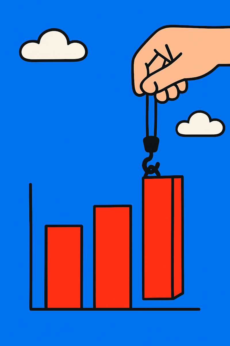
Here's another controversial opinion: The best dashboards show less, not more.
Every metric in your dashboard UX design should pass the "Tuesday Test"—if this metric goes red on a random Tuesday, does the user know exactly what to do about it? If not, it's just anxiety fuel.
We've seen dashboards with 200+ available metrics. You know how many the average user actually uses? Seven. The same seven. Every day.
Targeting means:
Netflix doesn't give you a manual. Neither should your dashboard.
The Intuitive component leverages what psychologists call "borrowed cognition"—using mental models from other experiences to reduce learning curve. Your users already know how to use Amazon, Google, and their iPhone. Why make them learn a whole new language for your dashboard?
Intuitive design includes:
Different users have different dashboard relationships:
The Morning Coffee User: Checks once daily with their first cup, wants quick overview
The Always-On Warrior: Lives in the dashboard, needs real-time updates
The Oh-Oh Visitor: Only shows up when something's wrong, needs clear crisis navigation
Your dashboard must adapt to these rhythms, not force users into unnatural patterns. This is where most data visualization UX fails—it assumes everyone's a power user.
Great navigation is like a good conversation—it reveals depth gradually without overwhelming upfront. Think of it as the dashboard equivalent of "Would you like to know more?"
Progressive disclosure done right:
A mid-market SaaS company came to us with a problem: their customer success team was drowning in data but missing critical churn signals. Their dashboard showed 30+ metrics across multiple tabs. CSMs spent more time navigating than helping customers.
The Transformation:
We killed 23 metrics. (Yes, really. The screaming stopped after week two.)
The new dashboard had just three sections:
Results after 6 months:
The secret? We stopped showing everything and started showing what mattered.
A Fortune 500 financial services company had spent $500K on a "comprehensive executive dashboard." Usage after 6 months? Three logins. Total.
Why it failed: It was built for analysts, not executives. TMI city.
The fix:
The result: Daily usage by 85% of executives within one month.
Symptom: "We need to add just one more metric..."
Reality: Every metric you add dilutes the importance of others
Fix: For every metric you add, remove two
Symptom: Launch dashboard, never update it
Reality: Business evolves, dashboards must too
Fix: Quarterly reviews with actual users
Symptom: No training, no onboarding, no adoption plan
Reality: Even Netflix has an onboarding flow
Fix: Progressive onboarding that celebrates early wins
Symptom: Gorgeous on 27" monitor, unusable on phone
Reality: Your CEO checks dashboards on their phone at 6 AM
Fix: Mobile-first, always
Enough theory. Here's exactly what to do next:
As we look ahead, SaaS dashboard design is evolving beyond showing data to predicting needs. Imagine dashboards that:
But here's the thing: all the AI and fancy visualizations in the world won't matter if we forget the human at the other end. Because at 11 PM, when revenue is down and you need answers, you don't need a smarter dashboard—you need a more helpful one.
Building on product design best practices, great dashboard design represents the next critical touchpoint where psychological principles guide interface decisions. The same attention to user psychology that creates successful onboarding experiences becomes essential for dashboards users rely on daily.
Ready to transform your data into decisions? Our comprehensive SaaS dashboard design approach combines these psychological insights with practical business requirements. We create interfaces that don't just display data—they drive action and deliver results.
Because your dashboard should be reducing stress, not creating it. And definitely not keeping you up until 11 PM.