SaaS Gamification Design
September 8, 2025

Discover SaaS design best practices from 100+ successful products. Learn proven UX principles that increase conversions by 400% and reduce churn.
Picture this: It's 2025, there are over 30,000 SaaS companies fighting for attention, and 73% of organizations plan to run almost entirely on SaaS by year's end.
Your product is one of them.
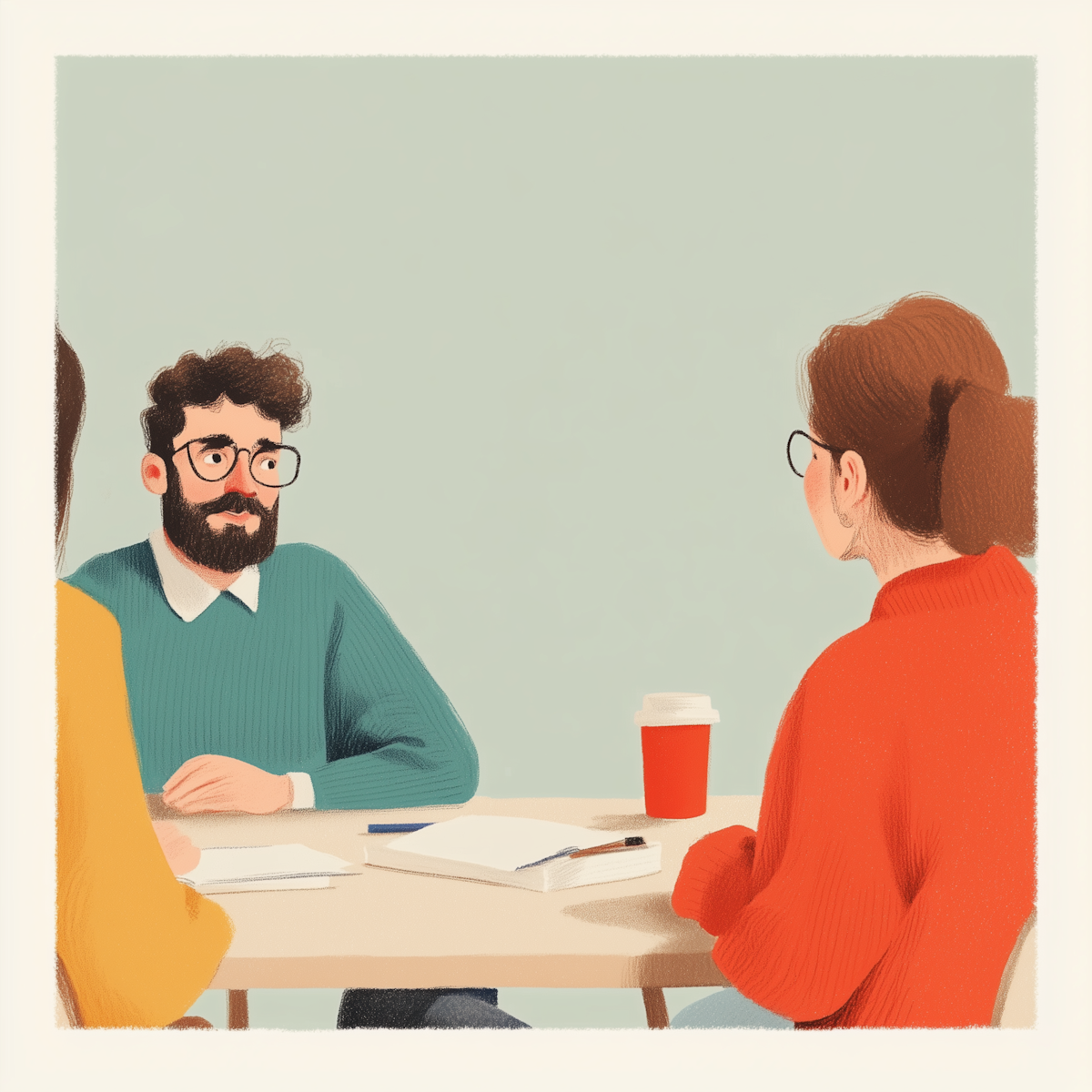
So here's the million-dollar question: Why do users choose Slack over Microsoft Teams? Why does Notion feel delightful while Confluence feels like homework? Why do some SaaS products become verbs ("just Figma it") while others become cautionary tales?
After dissecting design patterns from over 100 successful SaaS products—from scrappy startups that became unicorns to enterprise giants that actually got it right—I've got news for you:
The difference isn't features. It's feelings.
Let me drop a truth bomb that'll ruffle some feathers: Your features don't matter as much as you think they do.
gasp clutches pearls updates LinkedIn bio to "thought leader"
But seriously, when was the last time you chose a SaaS product purely based on its feature list? Exactly. You chose it because it didn't make you want to throw your laptop out the window.
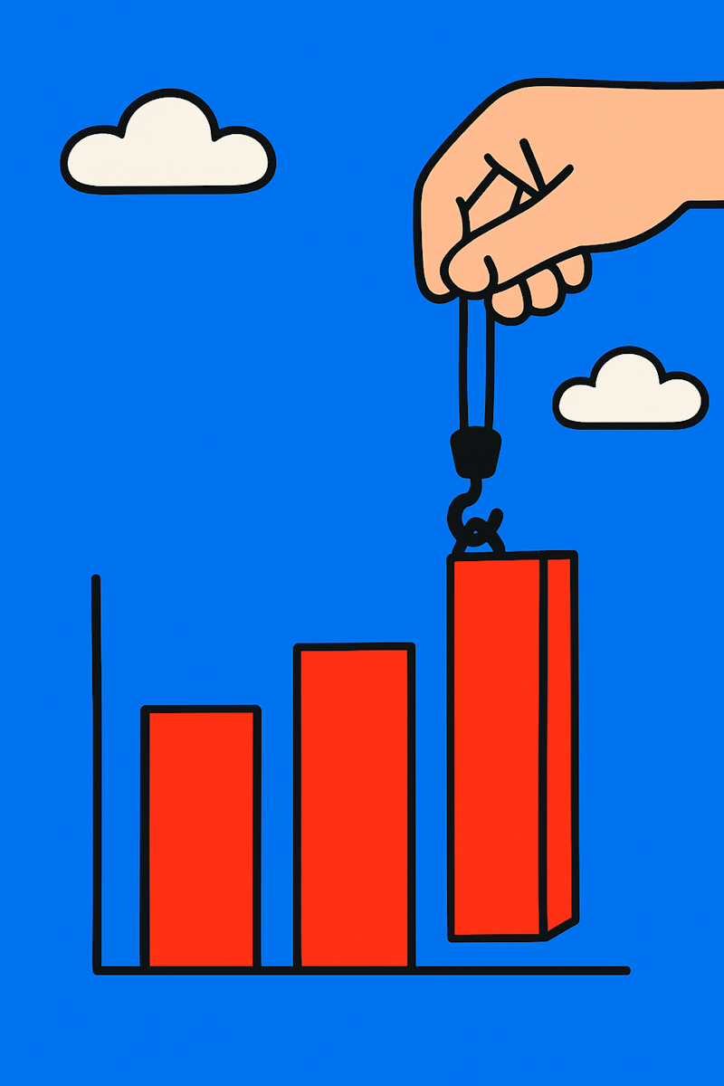
Companies that prioritize SaaS design best practices see:
These aren't feel-good metrics. This is the difference between Series B and shutting down.
Every successful SaaS product nails three things:
Miss any one of these, and you're building a very expensive hobby.
After watching hundreds of SaaS products succeed and fail, patterns emerge. Here are the SaaS UX best practices that separate the Slacks from the slacks:
You know that detailed user persona you created? The one with the stock photo, the made-up hobbies, and the conveniently simple needs?
Burn it.
Here's what actually works: Talk to real humans who curse at their computers.
Leading companies invest 15-20% of their design budget in continuous user research. Not because they're rich, but because they're not stupid. They know that building based on assumptions is like driving blindfolded—exciting but ultimately painful.
The Sephora Revelation
Sephora's team discovered millennials would browse products on their site, then bounce to YouTube to watch people actually use them. Instead of fighting this behavior, they created their own videos.
Boom. Conversion rates through the roof.
That's the power of understanding actual behavior versus assumed behavior.
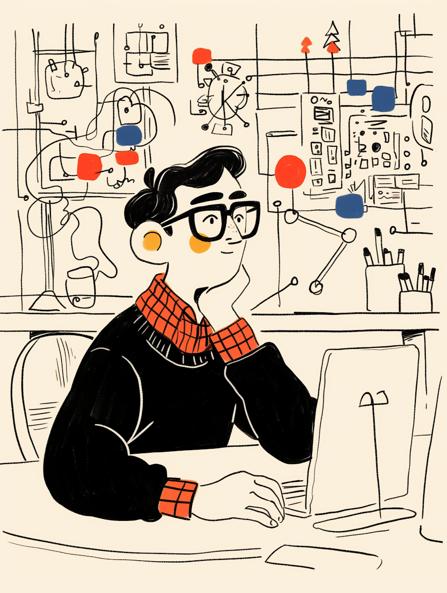
You know that feeling when you open a new SaaS tool and it looks like the cockpit of a 747? That's what we call "feature vomit," and it's killing your adoption rates.
Progressive disclosure is like a good first date—reveal interesting things gradually, don't dump your entire life story in the first five minutes.
How winners do it:
Real example: Freed.ai's medical scribing tool doesn't overwhelm doctors with every possible feature. It starts with "record a conversation" and gradually reveals its AI superpowers as users get comfortable.
Instagram tried horizontal scrolling in 2018. Users revolted like it was the Boston Tea Party. They reversed it faster than you can say "user retention."
The lesson? Your innovative navigation isn't innovative. It's annoying.
Successful SaaS interface design leverages what users already know:
Save your innovation for solving actual problems, not creating new ones.
Here's what nobody admits: B2B buyers are still humans. They have feelings. They get frustrated. They feel accomplished. They recommend tools they love and bash tools they hate.
The best SaaS user experience acknowledges this:
Micro-delights that matter:
Trust builders that convert:
Your CEO checks your product on their phone at 6 AM while half-asleep. Your power user manages tasks during their commute. Your trial user's first experience might be on a tablet.
Yet most SaaS products are still designed on 27" monitors for 27" monitors.
Mobile-first doesn't mean mobile-only. It means:
Let me share the framework we use that's helped dozens of SaaS companies level up their design game:
User journey mapping isn't about pretty diagrams. It's about understanding the cursing moments:
Methods that actually work:
Your navigation is like your house's floor plan. If people need a map to find the bathroom, you've failed.
What works:
Visual hierarchy that guides without shouting:
Component consistency that scales:
Users will forgive ugly. They won't forgive slow.
Performance targets that matter:
The Challenge: Enterprise communication tools were feature-rich nightmares that required IT degrees to configure.
The Insight: People already knew how to text. Why not make work chat feel like consumer messaging?
The Execution:
The Lesson: Sometimes the best SaaS design principles involve doing less, not more.
The Challenge: Users needed docs, wikis, databases, and project management. Separately, these tools created chaos.
The Insight: Let users build what they need with flexible blocks, not rigid templates.
The Results:
The Lesson: Flexibility beats features when users can shape the tool to their needs.
The Challenge: Design tools were desktop-bound islands. Collaboration meant emailing files and praying.
The Innovation: Real-time collaboration that felt magical, not technical.
The Impact:
Symptom: "Our competitor has it, so we need it too!"
Reality: Users don't want features. They want solutions.
Fix: For every feature request, ask "What problem does this solve?"
Symptom: Launch and move on to the next thing
Reality: SaaS products are living things that need constant care
Fix: Dedicate 30% of design resources to optimization
Symptom: Designing for the loudest 5% of users
Reality: 80% of users need 20% of features
Fix: Separate power features from core flows
Symptom: "Our users don't use mobile"
Reality: They do. You just made it painful.
Fix: Check your analytics. Be horrified. Fix it.
Ready to stop reading and start doing? Here's your roadmap:
The SaaS products winning today aren't just tools—they're partners. They:
The principles outlined here, validated across 100+ successful products, aren't just theory—they're your competitive advantage waiting to be activated.
Building on dashboard design best practices and modern user expectations, these SaaS design best practices create products users choose enthusiastically rather than tolerate reluctantly.
For teams ready to transform their SaaS products through strategic design, our research-backed SaaS design approach has helped dozens of companies achieve the metrics that matter: higher conversions, lower churn, and users who actually love their tools.
Because in 2025, good enough isn't good enough. Your competition is one delightful experience away from stealing your customers.
Time to level up.